Small front-end decisions can quietly make a layout fragile, messy, or harder to scale.
These examples show what often goes wrong in real projects — and what a cleaner, more professional solution looks like instead. The goal is not just to say “this is prettier.” It is to show why the stronger version usually behaves better when the design grows, the content changes, or the screen gets smaller.
FrontFixer is about making invisible layout mistakes visible. A lot of code looks acceptable at first glance, especially in static screenshots. But production quality lives underneath that first impression. Each example below highlights a common front-end decision, what makes the weaker version fragile, and why the stronger version tends to be more stable, scalable, and easier to maintain.
Header Layout — Absolute positioning vs Flexbox
A header can look aligned in a screenshot and still be structurally weak underneath. When pieces are pushed into place manually, the layout becomes fragile the moment the logo changes, the menu grows, or the button text gets longer. Flexbox solves that by letting structure do the alignment instead of offsets and guesswork.
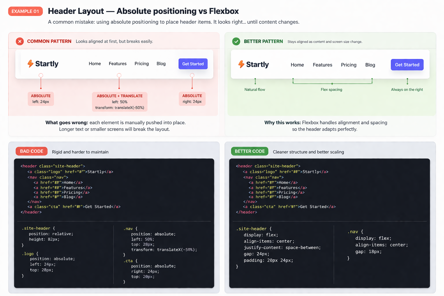
Why the flexbox version is the safer pattern
Real layouts move. Menus expand, CTAs change, and content shifts. A flexbox-based structure absorbs those changes much more gracefully because spacing is controlled by the layout system itself, not by manual nudges.
Card Grid — Fixed widths vs Responsive Grid
A card layout can look calm and organized on desktop, then fall apart as soon as the screen gets tighter. Fixed widths often create awkward wrapping, ugly spacing, and broken rhythm. A responsive grid keeps the system flexible without needing patchwork fixes later.
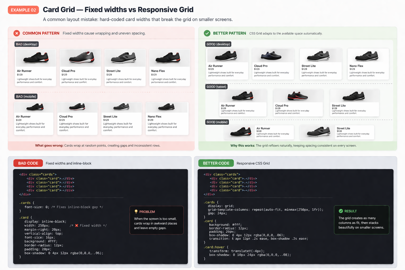
Why the responsive grid version is better
CSS Grid adapts to the available space instead of forcing every card into a rigid box. That means fewer broken rows, more balanced spacing, and a layout that behaves like a system instead of a fragile arrangement.
Full-Width Section — 100vw overflow vs Container approach
Using 100vw often feels like the fastest way to create a dramatic full-width section. In real projects, it can quietly cause horizontal scroll, broken alignment, and spacing that feels slightly off. A container-based approach gives you the width effect without the layout bug.
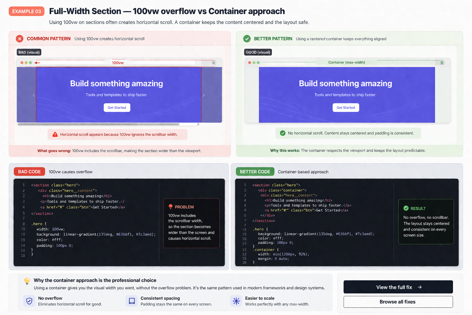
Why the container approach is the safer pattern
100vw includes the scrollbar width, which can make a section slightly wider than the viewport. That sounds tiny, but tiny layout bugs are exactly what make a page feel broken. A container-based structure keeps content centered, controlled, and free from sideways scroll.
Sticky Sidebar — Broken by overflow vs Proper structure
Sticky sidebars are useful until a parent container quietly breaks the behavior. In many real-world layouts, the problem is not sticky itself. It is the surrounding structure, scroll context, or overflow rule that traps the element and kills the effect.
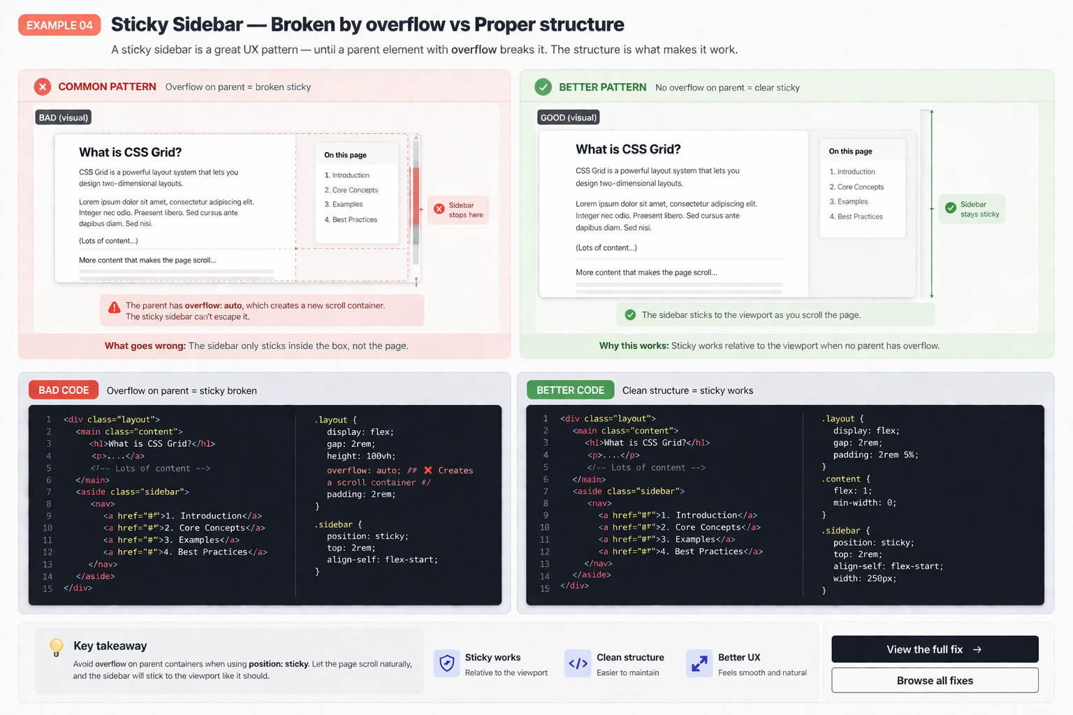
Why structure matters more than the sticky rule itself
Sticky only works when the layout around it allows it to work. If a parent creates a competing scroll context, the sidebar gets trapped. That is why clean structure matters more here than simply repeating position: sticky and hoping for a different result.
HTML Structure — Div soup vs Semantic markup
A page can look identical in the browser and still be much worse underneath. When everything becomes a generic div, the code gets harder to understand, harder to maintain, and weaker as the layout grows. Better markup gives the rest of the front-end a stronger backbone.
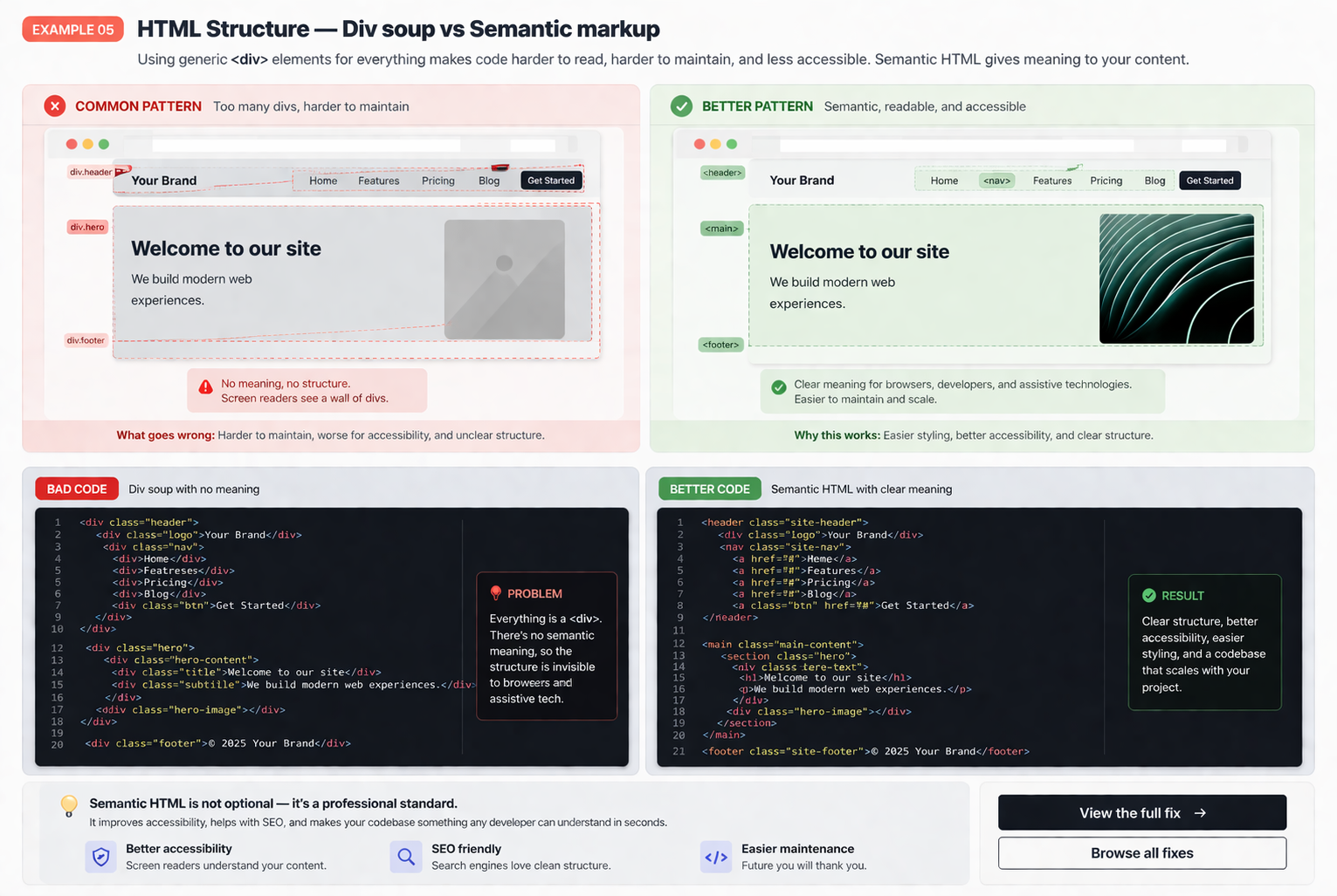
Why better structure improves everything around it
Clean markup does not just help readability. It improves layout control, reduces styling friction, and makes future changes less chaotic. Good structure usually means fewer surprises later because the layout is growing on top of a cleaner foundation.