

Why does CSS specificity override my fix?
Understand how the cascade, specificity, source order, inheritance, and real component conflicts work together — so your styles win every time.

.card {
 color: blue;
}
#app .card {
 color: red;
}
/* higher specificity wins */
.card {
 color: blue;
}
#app .card {
 color: red;
}
/* Fix: increase specificity */
#app .card--primary {
 color: blue;
}
 FIX LOST
Premium Runner Pro
The intended blue title is crossed out. A stronger selector still forces the product title to stay red.
Status: Fix overridden
FIX WINS
Premium Runner Pro
The corrected selector wins in the cascade, so the product title finally follows the intended blue style.
Status: Specificity fixedYour CSS is not missing. It is losing.
Specificity override bugs happen when your declaration is part of the page but does not become the used value. That difference matters. If your CSS rule never appears in DevTools, you are probably dealing with cache, loading order, a broken file path, an enqueue problem, or a selector that does not match. But if the rule appears and is crossed out, the browser has already accepted it. The browser is simply choosing another declaration.
The fastest way to debug this is not to add a longer selector. The fastest way is to find the winning rule. Select the element in DevTools. Look at the Styles panel. Find the property you tried to change. Then look for the same property below or above it. The declaration that is not crossed out is the winner. That winner tells you the real cause: stronger selector, later source order, inline style, important declaration, cascade layer, media query, component scope, or shadow DOM boundary.
That is why this fix is the father of the first 99 fixes. Many CSS bugs are not actually property bugs. They are cascade bugs. A button color, card title, pricing highlight, form error state, product badge, mobile spacing rule, or menu active state can all fail for the same hidden reason: the browser is obeying another rule with a stronger cascade position.
Rule missing
If your rule does not appear in DevTools, first check cache, file loading, selector spelling, and whether the CSS is being printed on that page.
Rule crossed out
If the rule is visible but crossed out, the browser loaded it but another declaration won the cascade.
Rule winning
If your rule is winning but the result still looks wrong, the problem may be layout, inheritance, computed values, invalid property use, or a different element.
Related: Test the broken HTML and CSS in the FrontFixer Live Inspector, then inspect selector conflict, source order, inline style, and important escalation before adding heavier code.
Specificity is only one part of the cascade.
Developers often say “specificity problem” for every CSS rule that does not apply, but the browser uses more than selector weight. The cascade compares origin, importance, cascade layer, selector specificity, scoping proximity, and source order. In everyday front-end work, the most common fights are selector weight, source order, inline styles, important declarations, and media query order.
Specificity itself is the weight of the selector. An ID selector is heavier than a class selector. A class selector is heavier than an element selector. A selector with multiple classes can beat a single class. A long descendant selector can beat a clean utility class. But specificity is not a moral score. A heavier selector is not automatically better CSS. Heavy selectors can make a site harder to maintain because every future override needs to be heavier again.
The professional solution is to design a cascade path. Base styles should be easy to override. Components should have predictable state classes. Utilities should be intentionally allowed to win. Page-specific fixes should load after shared component CSS. Temporary debug overrides should be removed after the real source is fixed. When the cascade has a system, you do not need to shout with selectors.
Selector weight
A stronger selector can beat your new class even if your new class looks cleaner.
Source order
When specificity is equal, the declaration that appears later usually wins.
Inline style
A style attribute can override normal stylesheet declarations and make a component feel locked.
Layers
A later cascade layer can beat a more specific rule from an earlier layer.
Read the winning rule like a browser detective.
A good specificity fix starts with a very boring action: click the exact element. Do not inspect the parent because it looks close. Do not inspect the visible card if the title inside the card is the element that refuses to change. Specificity bugs often hide one level deeper than expected. A class may be on the wrapper while the color, background, border, padding, or display property lives on a child element. This is especially common with WordPress blocks, product cards, button wrappers, form fields, and navigation menus.
After selecting the exact element, search for the property you tried to fix. If the problem is a title color, search for color. If the problem is a button background, search for background. If the problem is spacing, search for padding or margin. The losing declaration will often be crossed out. The winning declaration will not be crossed out. The file name, line number, and selector beside that declaration are more important than the value itself because they tell you where the rule came from.
Once you find the winner, ask why it won. Did it win because the selector has more classes? Did it win because it appears lower in the file? Did it come from a later stylesheet? Did it come from a media query that only exists at this screen size? Did a page builder write the value directly into the HTML with style=""? Did a plugin add !important? Each answer points to a different kind of fix. A selector weight problem may need a scoped selector. A source order problem may need the override to load later. An inline style problem may need the source setting removed. An important problem may need the important declaration cleaned at the source.
This workflow protects you from the most expensive mistake in CSS debugging: changing the wrong rule. Many developers see a crossed-out declaration and immediately paste a stronger selector at the bottom of the page. It works for ten minutes, then breaks a second component. The professional move is slower for the first thirty seconds and faster for the rest of the project. You identify the real source, decide whether the original rule is too heavy, and choose an override that belongs to the component system.
Step 1
Select the exact element, not the closest wrapper. The wrapper may not own the property that is failing.
Step 2
Find the property that refuses to change and compare the crossed-out declaration with the winning one.
Step 3
Fix the reason the winner wins instead of adding random selector weight.
<h3 class=”product-title”>
<p class=”description”>
</article>
crossed out · fix is loaded but losing
winning declaration · inspect file and selector source
Do not memorize numbers. Understand pressure.
Specificity is often explained with number groups: inline styles, IDs, classes, attributes, pseudo-classes, elements, and pseudo-elements. That model is useful, but in daily work the more practical idea is pressure. Every selector applies pressure to win a property. IDs apply heavy pressure. Classes and attributes apply medium pressure. Elements apply light pressure. Source order applies pressure when the selector weight is equal. Cascade layers can change the contest before specificity even gets compared.
This is why a selector like .card-title can lose to .product-card .content h3.card-title. The second selector is not smarter. It simply applies more pressure. It names the product card, the content wrapper, the element, and the title class. If you respond with body .page .shop .grid .product-card .content h3.card-title, you may win, but you also create a future problem. The next person must now beat your selector, and the stylesheet begins to grow like a chain of revenge.
A better mental model is ownership. Ask which part of the system should own the visual decision. Should the button component own its base color? Should the hero section own a special hero button? Should a utility class be allowed to override text color anywhere? Should a sale state override a neutral badge? Should a WordPress block inherit the global button style, or should the page define a special milestone button? Once you know ownership, specificity becomes a tool instead of a fight.
Low-specificity systems are easier to maintain because they keep ownership clear. The base component uses one class. Variants use one additional class or data attribute. Utilities load in a known place. Page-specific overrides stay inside a page wrapper. Emergency CSS stays temporary. That kind of discipline feels less dramatic than a giant selector, but it is the difference between a site that grows and a site that slowly becomes untouchable.
ID pressure
Powerful and usually too heavy for normal component styling.
Class pressure
Ideal for components, states, utilities, and page-level wrappers.
Element pressure
Light by itself, but risky when chained through many descendants.
Order pressure
The quiet winner when two selectors are equally specific.
Specificity bugs are louder on WordPress because many systems write CSS at the same time.
On a hand-coded static page, you often know where every rule came from. On a WordPress site, the cascade may include the theme stylesheet, block library CSS, plugin CSS, customizer CSS, page builder CSS, snippet CSS, cached/minified CSS, and content-specific HTML. That does not make WordPress bad. It just means the cascade has more authors. A rule can be technically correct and still lose because it is entering a crowded room.
The common WordPress mistake is placing a small custom rule in a random snippet and expecting it to beat everything. Sometimes it will. Sometimes it will not. A block button may have a generated class. A plugin form may print field styles after your theme. A page builder may write inline styles. A cache plugin may serve an older combined file. A theme may use long selectors to style navigation and content areas. If you do not know the order, you cannot trust the outcome.
That is why milestone pages should have their own wrapper class and their own scoped CSS. The wrapper tells the browser and the developer, “this visual system belongs to this page.” Instead of writing global selectors like .card, .button, or section, the milestone CSS should write selectors such as .ffx-fix100 .ffx100-example and .ffx-fix100 .ffx100-btn. This gives the page a premium visual identity without contaminating older fixes, archives, the homepage, or the Live Inspector.
Page-specific CSS is not a shortcut when it is scoped correctly. It is a safety boundary. A normal fix article can use the standard FrontFixer layout. A milestone fix can use a more cinematic structure. The difference is acceptable because the milestone wrapper prevents the premium style from leaking into every post. The site can have a special event page without turning the global CSS into a dangerous shared bomb.
Production rule: if a CSS snippet is meant for one page, every selector should start with the page wrapper. For this milestone, that wrapper is .ffx-fix100. No loose .card. No loose .btn. No loose h2. No loose section.
Do not blame specificity for every CSS failure.
Specificity is powerful, but it is not the answer to every CSS problem. If the declaration does not appear in DevTools, the issue is usually not specificity. The CSS may not be loading. The cache may be serving an older file. The selector may not match the generated HTML. The class may be misspelled. The property may be invalid. The value may be invalid. The element may be inside an iframe or shadow DOM. The browser may support the property differently than expected. A parent layout rule may be controlling the visual result.
For example, if z-index does not work, the problem may be stacking context, not specificity. If margin seems ignored in a flex or grid layout, the problem may be alignment or available space. If a transition does not animate, the problem may be that the property is not animatable or the starting value is missing. If a class does not apply, the problem may be that the class is on the wrong element. If a width does not shrink on mobile, the problem may be an image, table, or long word causing overflow.
This matters because the wrong diagnosis creates worse CSS. If the real problem is invalid HTML and you respond with heavier selectors, the page becomes harder to debug and still may not be correct. If the real problem is cache and you respond with !important, you create a future override problem for no reason. If the real problem is media query order and you edit only the desktop rule, the bug will keep coming back on phones.
The clean question is simple: can I see my declaration in DevTools, and is it crossed out? If yes, investigate the cascade. If no, investigate loading, matching, validity, and structure first. This one question separates specificity bugs from everything else.
Not visible
Debug loading, cache, selector match, or whether the code is printed on this page.
Visible and crossed out
Debug specificity, order, layers, inline styles, important, or responsive context.
Visible and winning
Debug layout, inheritance, computed values, wrong element, unsupported behavior, or another property.
Check file loading, cache, selector match, invalid CSS, iframe boundaries, and whether the code is printed on this page.
Compare importance, layer, specificity, scope, media-query context, inline style, and source order.
Inspect layout, inheritance, computed values, wrong element targeting, unsupported behavior, and competing properties.
Same asset. Same layout. One CSS decision changed.
A trustworthy broken-versus-fixed demonstration does not swap the product, crop, or composition. It keeps the evidence stable so the reader can see exactly which cascade decision changed the interface.
 FIX LOST
Premium Runner Pro
The product stays identical. Only the title state proves the selector lost.
FIX WINSPremium Runner Pro
Same asset, same card, same copy. The corrected cascade is the only variable.
Broken code, corrected code, and real visual impact.
Each example below recreates a normal front-end pain with a complete interface, the losing rule, the corrected rule, and a visible product consequence. The subject and layout stay consistent between the broken and fixed sides so the reader can isolate the cascade change immediately.
Product card title color refuses to change
A developer adds a clean class to make a product title blue, but the title stays red because the shop card selector is more specific.
.product-title {
 color: #2563eb;
}
.shop-card .content h3.product-title {
 color: #b42318;
}
.shop-card .product-title {
 color: #2563eb;
}
/* Better long-term:
   reduce the original selector
   and style the component with classes. */
CTA button keeps the old theme color
This happens constantly in themes and landing pages. The custom button class is simple, but the hero button rule is loaded with component context.
.cta-button {
 background: #ff5a16;
}
.hero .hero-actions .button.cta-button {
 background: #111827;
}
 FIX LOST
.hero .cta-button {
background: #ff5a16;
}
/* Or load this override after the hero component file
if the selector weight is already equal. */
Sale badge style is ignored
A badge should look urgent, but the generic badge system wins because the sale class is only a single class and the component rule is stronger.
.is-sale {
 background: #ef4444;
 color: white;
}
.product-card .badge {
 background: #f3f4f6;
 color: #111827;
}
 FIX LOST
.product-card .badge.is-sale {
background: #ef4444;
color: white;
}
/* Component + state is clear:
this is a badge, and this badge is on sale. */
WordPress button block ignores your custom CSS
WordPress blocks often ship with their own class names. If your custom class is too weak or loads too early, the block style may win.
.orange-link {
 background: #ff5a16;
}
.wp-block-button .wp-block-button__link {
 background: #111827;
}
 FIX LOST
.wp-block-button .wp-block-button__link.orange-link {
background: #ff5a16;
}
/* Alternative:
add a wrapper class to the block group
and target the button inside that group. */
Navigation active link color does not apply
The active menu item should stand out, but a header navigation selector beats the state class. The result is a menu where the current page does not look current.
.active {
 color: #ff5a16;
}
.site-header nav ul li a {
 color: #111827;
}
 FIX LOST
.site-header nav a.active {
color: #ff5a16;
}
/* Better:
use .nav-link and .nav-link--active
instead of relying on element chains. */
Form error message will not turn red
Form plugins and design systems often style inputs and messages aggressively. A simple error class can lose to field-specific selectors.
.error-message {
 color: #ef4444;
}
.contact-form .field .message {
 color: #667085;
}
 FIX LOST
.contact-form .message.error-message {
color: #ef4444;
}
.contact-form .field.is-invalid .message {
color: #ef4444;
}
Pricing card highlight does not work
A “Popular” pricing card should look different, but the base pricing card style wins because the highlight class is not scoped to the component.
.featured {
 border-color: #ff5a16;
 transform: translateY(-6px);
}
.pricing-grid .pricing-card {
 border-color: #e5e7eb;
 transform: none;
}
 FIX LOST
.pricing-card.featured {
border-color: #ff5a16;
transform: translateY(-6px);
}
/* The variant belongs to the card,
not to the entire page as a generic class. */
Mobile spacing fix works on desktop but loses on mobile
This one feels like a ghost bug. The desktop fix works, but a later media query redefines the same property on smaller screens.
.product-card {
 padding: 18px;
}
@media (max-width: 640px) {
 .product-card {
 padding: 32px;
 }
}
 FIX LOST
.product-card {
padding: 18px;
}
@media (max-width: 640px) {
.product-card {
padding: 18px;
}
}
Utility class loses to component CSS
Utility classes are supposed to be quick and predictable. But if component CSS has heavier selectors and loads after utilities, the utility class becomes unreliable.
.text-blue {
 color: #2563eb;
}
.article-card .card-title {
 color: #111827;
}
 FIX LOST
/* Components first */
.article-card .card-title {
color: #111827;
}
/* Utilities later */
.text-blue {
color: #2563eb;
}
Inline style from a builder blocks the fix
Page builders, JavaScript widgets, and marketing tools sometimes inject inline styles. A normal stylesheet rule will usually lose to a style attribute.
.promo-title {
 color: #2563eb;
}
<h2 class="promo-title" style="color:#b42318">
 Summer Promo
</h2>
 FIX LOST
<h2 class="promo-title promo-title--summer">
Summer Promo
</h2>
.promo-title--summer {
color: #2563eb;
}
Better CSS systems avoid selector wars.
The examples above show how CSS breaks in real pages. The patterns below show how to stop the same kind of problem from returning. These are not decorative tricks. They are production habits: low specificity components, cascade layers, design tokens, state attributes, and a WordPress override map.
Low-specificity component pattern
Use simple component classes and keep the base selector easy to override. The :where() selector is useful because it can group context without adding specificity.
:where(.shop-section) .product-card {
 border: 1px solid #e5e7eb;
}
.product-card--featured {
 border-color: #ff5a16;
}
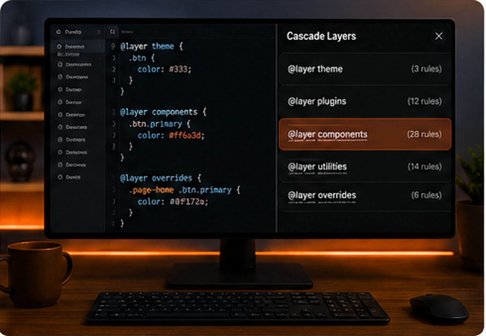
Cascade layer pattern
Layers make the override path explicit. A utility layer can be designed to beat component defaults without needing huge selectors.
@layer reset, base, components, utilities;
@layer components {
 .card-title { color: #111827; }
}
@layer utilities {
 .text-blue { color: #2563eb; }
}
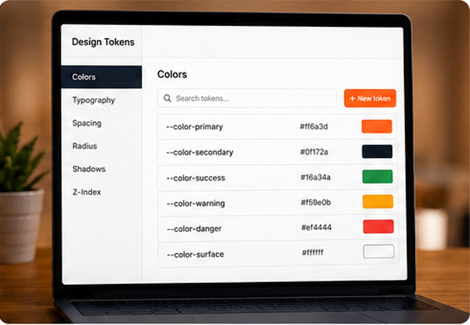
Design token override pattern
Instead of fighting the same property in multiple selectors, expose the visual decision as a custom property. The component reads the token, and variants change the token.
.product-card {
 --title-color: #111827;
}
.product-card__title {
 color: var(--title-color);
}
.product-card--sale {
 --title-color: #b42318;
}
State attribute pattern
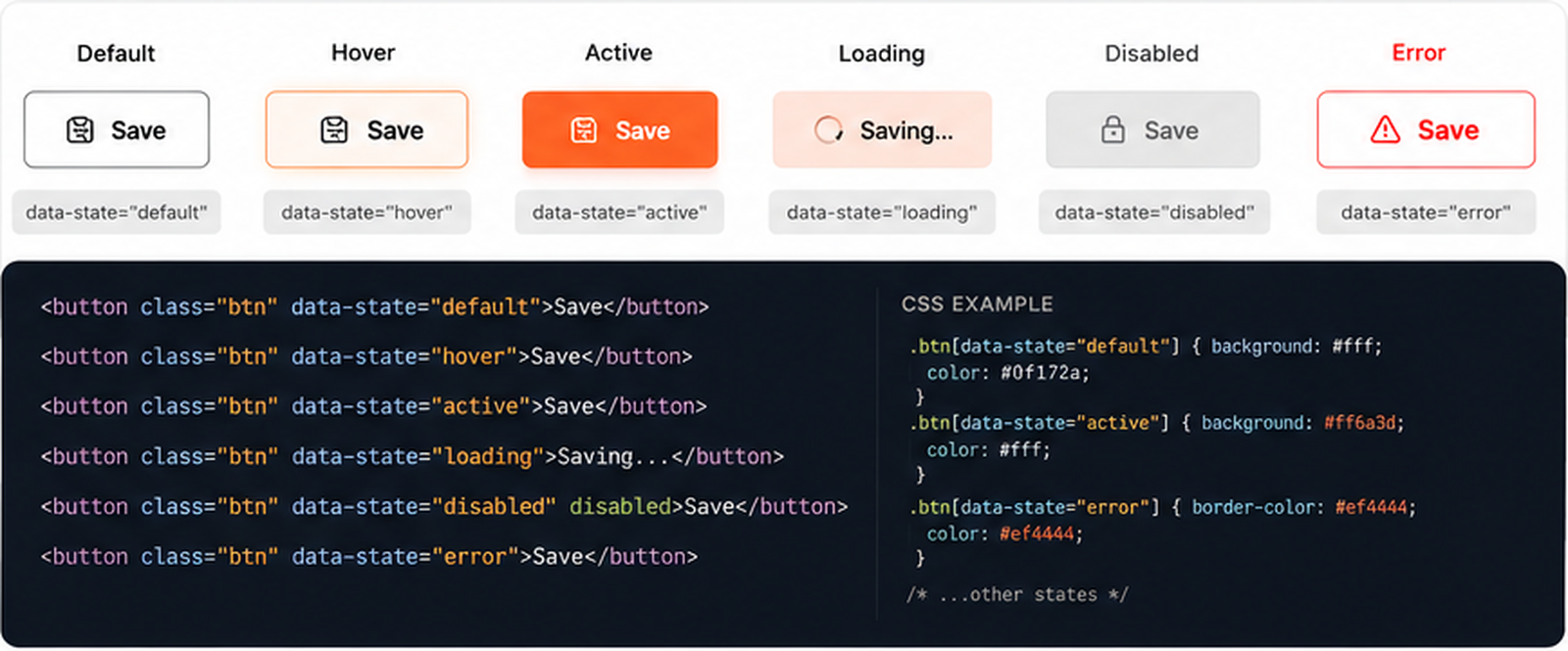
Data attributes make states readable and predictable. This is useful when a component has modes like active, disabled, sale, featured, open, loading, or error.
.card[data-state="featured"] {
 border-color: #ff5a16;
}
.form-field[data-state="error"] .message {
 color: #ef4444;
}
WordPress override map pattern
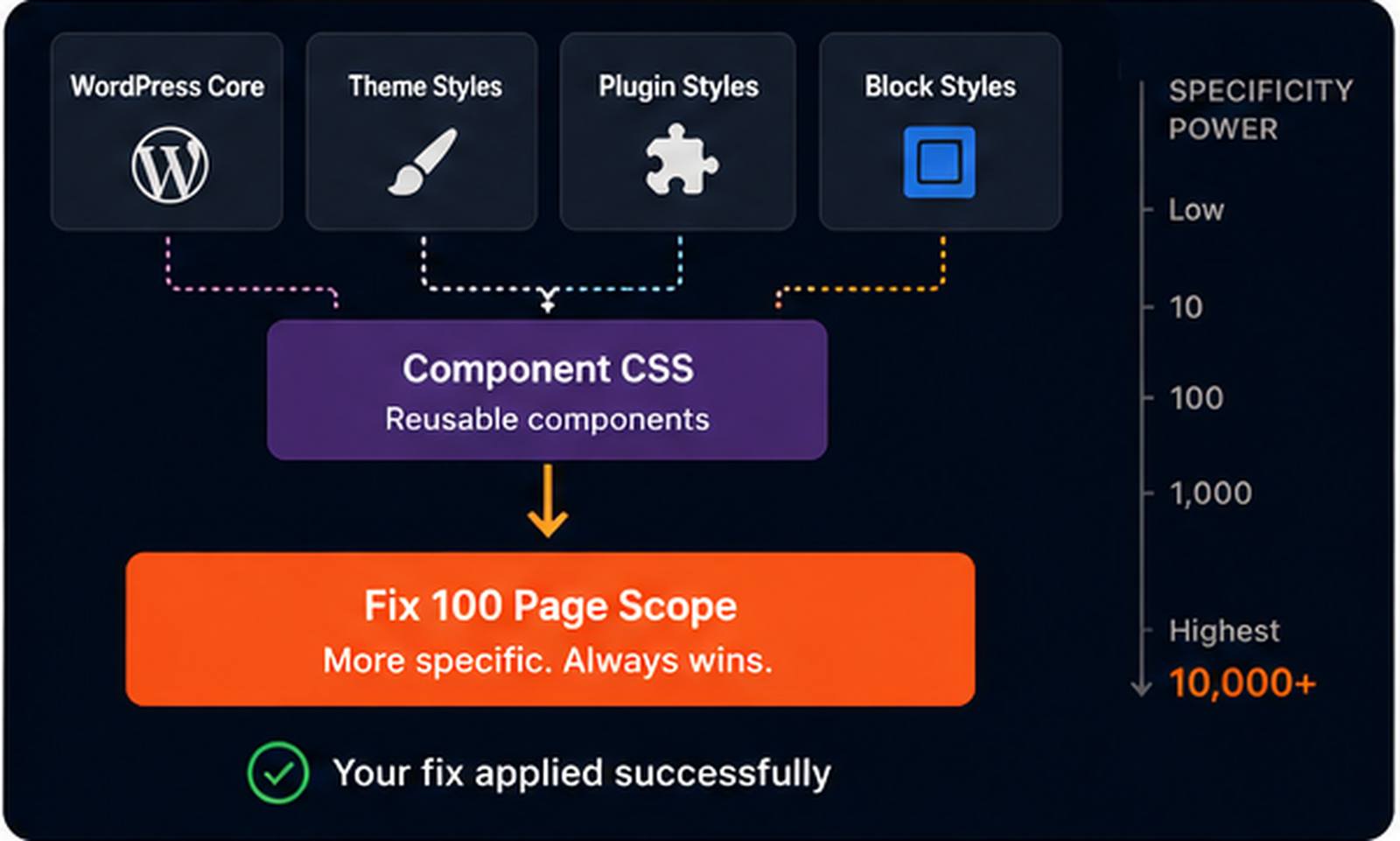
In WordPress, the cleanest solution is often not heavier CSS. It is knowing where each layer comes from: theme, block, plugin, custom snippet, page CSS, and temporary debug CSS.
1. Theme defaults
2. Block styles
3. Plugin styles
4. Custom component CSS
5. Page-specific milestone CSS
6. Temporary debug overrides
Important is an escape hatch, not a workflow
!important can be correct in rare utility systems or emergency overrides, but using it as the first response turns every future change into a fight. Before using it, ask why the normal cascade cannot win.
/* Not first: */
.button { color: orange !important; }
/* First ask:
   Which declaration is winning,
   and why does it have permission to win? */
How to debug a specificity override without guessing.
Use this checklist when a CSS fix looks correct but the page refuses to change. The goal is to identify the winning declaration before writing the next line of CSS. This prevents selector escalation, random important declarations, and changes that fix one page while breaking another.
- Inspect the exact element that should receive the style.
- Confirm that your CSS rule appears in DevTools.
- If the rule is missing, debug loading before specificity.
- If the rule is crossed out, find the declaration that wins.
- Compare selector specificity, not only class names.
- Check whether the winning rule appears later in the stylesheet.
- Check the same property inside media queries.
- Look for inline styles generated by builders, scripts, or plugins.
- Look for
!importantbefore adding another one. - Check whether cascade layers are changing the winner.
- Reduce the original heavy selector when you control the CSS.
- Scope overrides to the component, not the whole page.
- Prefer state classes or data attributes over random long selectors.
- Use custom properties when variants only change values.
- Keep temporary debug CSS separate and remove it later.
- Document page-specific override rules on large projects.
What not to do when specificity overrides your fix.
Do not add IDs just to win
An ID may fix the current page, but it raises the weight of the system and makes future overrides harder.
Do not paste !important everywhere
Important can become a trap. If every fix needs important, the cascade is no longer designed.
Do not debug in the wrong breakpoint
If the bug appears only on mobile, inspect the element while the viewport is actually mobile.
Do not style wrappers by accident
Many WordPress and builder elements put your class on a wrapper while the visual style lives on a child.
Do not trust the class name alone
A class can exist and still lose. The final winner is decided by the cascade, not by your intention.
Do not leave debug CSS forever
Temporary overrides should be removed or converted into a clean component rule after the bug is understood.
Fix this without using !important.
You have a product card. The title should be blue only when the card is featured. The badge should be orange only when the card is on sale. The mobile padding should stay compact. The theme currently overrides all three. Your challenge is to fix the cascade path, not to shout louder.
Challenge CSS — three losing decisions
.featured { color: #2563eb; }
.is-sale { background: #ff5a16; }
.product-card { padding: 18px; }
.shop .grid .product-card h3 {
 color: #111827;
}
.shop .product-card .badge {
 background: #f3f4f6;
}
@media (max-width: 640px) {
 .product-card {
 padding: 32px;
 }
}
Clean solution — match scope, state, and media context
.shop .product-card.featured h3 {
 color: #2563eb;
}
.shop .product-card .badge.is-sale {
 background: #ff5a16;
 color: white;
}
@media (max-width: 640px) {
 .shop .product-card {
 padding: 18px;
 }
}
The solution is not magic. It targets the same component scope as the winning rules, fixes the state inside the component, and handles the mobile rule inside the mobile context. No important declaration is needed because the cascade path is now clear.
Keep debugging the cascade.
Specificity problems often appear beside class targeting, cache confusion, hover states, transitions, layout shifts, and z-index issues. Use these related fixes when the winning declaration is not the only problem.
The browser is not ignoring you. The cascade is answering first.
When CSS specificity overrides your fix, the correct response is not panic. The correct response is inspection. Find the winning declaration, understand why it wins, and then choose the smallest clean change that gives your rule permission to win. That may be selector scope, source order, a state class, a custom property, a cascade layer, or removing inline styling from the source.
Fix 100 matters because specificity is not just one bug. It is the invisible engine behind many CSS bugs. Once you can read the cascade, you stop treating CSS like a guessing game and start treating it like a system.